Why Your CTA Is the Most Important Part of the QR Code
The QR code itself is a machine instruction. The call to action is a human instruction — and humans respond to human language far better than they respond to a grid of black squares. Research consistently shows that QR codes with explicit CTAs are scanned significantly more often than identical codes printed without any surrounding text.
The reason is simple: uncertainty prevents action. When someone sees a QR code with no context, they have to decide whether to scan it without knowing what they'll get. That micro-decision is enough to cause most people to walk past. A strong CTA collapses that uncertainty in one short phrase.
Your QR code marketing strategy can only succeed if people actually scan the codes you deploy. CTAs are the bridge between a printed or displayed code and a conversion. Everything else — the destination URL, the landing page, the offer — only matters after the scan happens.
Every QR code you publish should answer two questions before the user decides whether to scan: What do I do? (Scan.) What do I get? (Your specific benefit.) If your CTA doesn't answer both, it's incomplete.
Action Verbs That Drive Scans
The single most important word in your QR CTA is the verb. Action verbs do two things simultaneously: they tell the user the physical action to take and they signal intent. Passive or ambiguous verbs reduce clarity and, with it, scan rates.
High-Performing Action Verbs
Not all verbs are equal. The following categories consistently outperform generic alternatives:
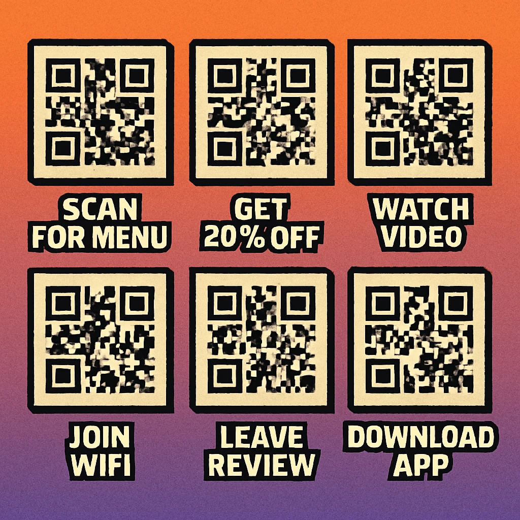
- Scan — Direct and unambiguous. "Scan to save 15%" is impossible to misread.
- Get — Positions the user as the recipient of something valuable. "Scan to get your free guide."
- Watch — Sets a clear expectation of video content. "Scan to watch the demo."
- Claim — Implies limited availability and personal ownership. "Scan to claim your offer."
- Download — Specific and transactional. "Scan to download the full report."
- Book — Service-oriented and actionable. "Scan to book a table."
- Unlock — Suggests exclusive access. "Scan to unlock member pricing."
- Try — Low-commitment and inviting. "Scan to try for free."
Verbs to Avoid
Some verbs sound professional but actually suppress action. Avoid "visit" (feels passive), "check out" (too casual and vague), "learn more" (overused and non-specific), and "see" (no urgency, no expectation). These phrases delay the user's decision rather than making it easier.
Replace "Learn more" with a specific outcome: "Scan to see pricing", "Scan to read the full story", or "Scan to compare models". Specificity always outperforms vagueness.
Benefit Statements: Completing the CTA Formula
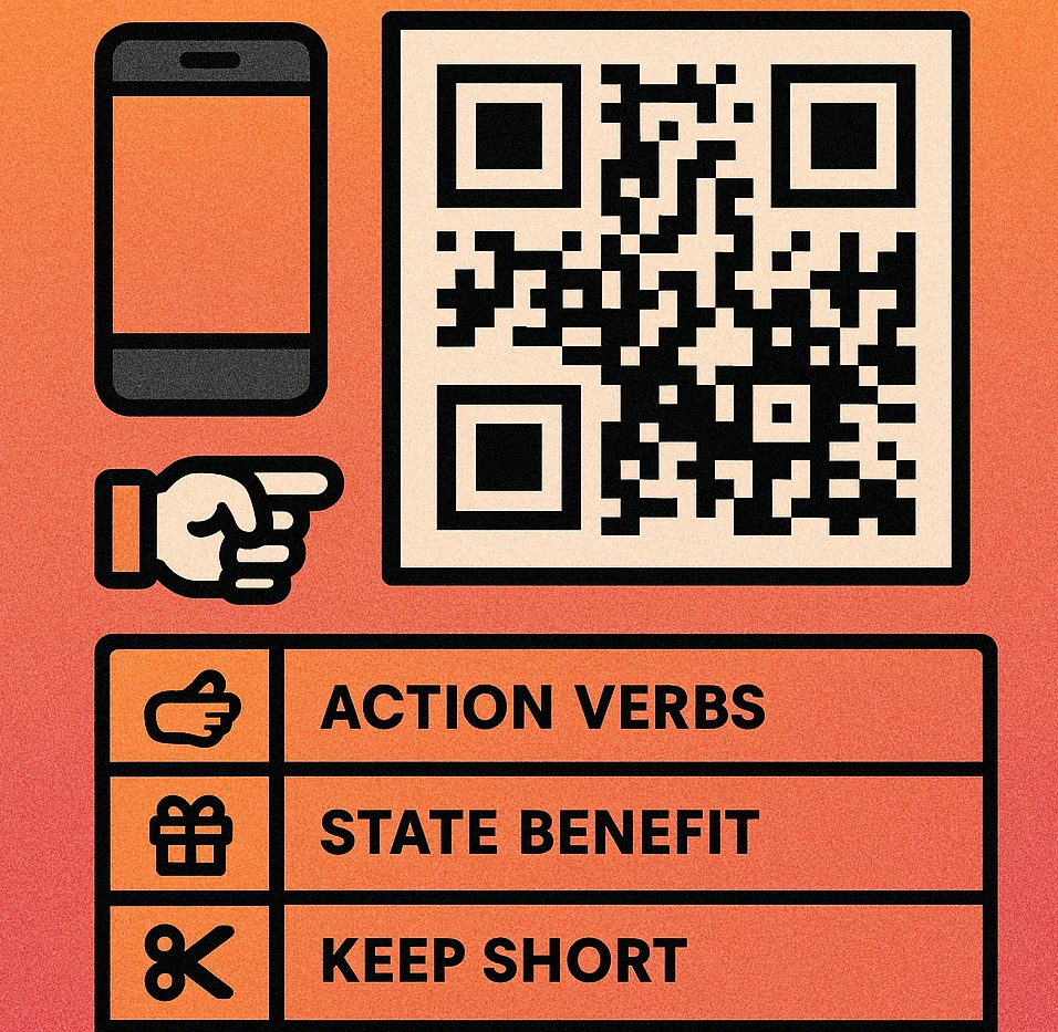
The full CTA formula is: [Action verb] + [specific benefit]. The action verb tells users what to do. The benefit statement tells them why it's worth their time. Together they form a complete call to action that can stand on its own without any other copy.
Strong benefit statements are:
- Specific: "Get 20% off your first order" beats "Save money".
- Immediate: "Scan to download instantly" beats "Scan to access our resources".
- Credible: "Scan to see 47 verified reviews" beats "Scan to read what customers say".
- Personal: "Claim your free sample" beats "Free samples available".
Keep the full CTA to 3–7 words. At typical reading distances — 30–60 cm for print, up to 3 metres for signage — people process short phrases in under a second. Beyond 7 words, comprehension slows and the decision window closes before they've finished reading.
Frame Design: Making the CTA Part of the Code
A frame turns your QR code from a standalone element into a complete, self-contained marketing unit. The frame holds the CTA text, creates visual hierarchy, and makes the code look intentional rather than pasted-on. For a deep dive into frame types and construction, see our guide on custom QR code design.
Five Frame Design Principles
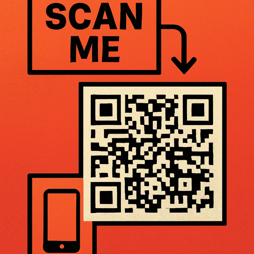
Place CTA text below the code. Eye-tracking studies of printed materials consistently show that readers glance at the QR code first, then look down. Text below the code is seen immediately after the user's attention lands on the code — exactly when they're deciding whether to act.
Use a contrasting background bar. A solid horizontal band behind the CTA text — in a brand colour or high-contrast neutral — makes the text pop away from the surrounding layout. This is especially important when the QR code is placed on a patterned or photographic background.
Keep the border tight but breathable. Frames that hug the quiet zone too closely risk being mistaken for part of the code's structure. Leave at least 4px of visual gap between the outer quiet zone and the frame's inner edge. The placement best practices guide covers quiet zone rules in full.
Match font weight to size. At small print sizes (code width under 3 cm), use bold or extra-bold type so CTA text stays legible. At large sizes (posters, banners), medium weight is sufficient. Never use fonts thinner than Regular (400) for CTA text.
Align frame style to brand tone. Rounded frames feel approachable and consumer-friendly. Sharp rectangular frames feel technical and corporate. Asymmetric or hand-drawn frames work for artisan and lifestyle brands. The frame is a brand signal as much as the QR code itself.
Contrast Rules and Visual Arrows
Two often-overlooked elements dramatically affect CTA effectiveness: typographic contrast and directional cues.
Contrast for CTA Text
Your CTA text must be legible at the distance and lighting conditions where it will be viewed. The WCAG AA standard requires a 4.5:1 contrast ratio for normal text. For outdoor signage viewed from over a metre away, aim for 7:1. In practice:
- Black text on white or yellow: ~21:1 contrast ratio — excellent for any context.
- White text on dark navy or black: ~17:1 — excellent for dark-background frames.
- White text on mid-orange or mid-red: often falls below 4.5:1 — test before printing.
- Grey text on white: typically below 3:1 — avoid entirely.
Contrast requirements for the QR code modules themselves follow different rules. Read the full breakdown in our placement best practices guide.
Visual Arrows and Directional Cues
A small curved arrow pointing from the CTA text toward the QR code does more than decorate — it closes the gap between instruction and action. Arrow cues are especially effective for:
- First-time scanners who aren't sure how to initiate a scan.
- Busy layouts (trade show booths, retail displays) where the QR code competes with other visuals.
- Distant signage where the code appears small relative to the surrounding artwork.
Keep directional cues simple — a single curved line with an arrowhead is enough. Complex illustrated arrows or hand-drawn callouts can overwhelm the CTA text. The goal is to guide the eye, not to decorate.
Write Your CTA — Then Build the Code
Decide on your CTA text first. Then open the generator, choose a frame style, and paste it in. Your code is ready to download in seconds — no account required.
CTA Examples by Industry
Effective CTAs are specific to their context. Generic templates underperform because they don't address the specific hesitations or desires of the audience. The following examples show how to tailor the CTA formula to different sectors.
| Industry | Context | Effective CTA | Why It Works |
|---|---|---|---|
| Retail | Product tag or shelf label | "Scan to see 83 reviews" | Specific social proof; removes purchase uncertainty |
| Restaurant | Table card or menu cover | "Scan to view today's menu" | Timely, practical, immediately useful |
| Events | Conference badge or booth display | "Scan to book a demo" | Clear transactional intent; zero friction |
| Real Estate | For-sale sign or property brochure | "Scan to take the virtual tour" | Unique value unavailable in print; curiosity-driven |
| Healthcare | Waiting room poster or prescription bag | "Scan for care instructions" | Practical utility; positions provider as helpful |
| Hospitality | Hotel room card or welcome letter | "Scan to request late checkout" | Solves a specific guest need; instant convenience |
| Education | Textbook, handout, or classroom poster | "Scan to watch the explainer video" | Extends learning beyond the page; clear format signal |
| Beauty & Personal Care | Product packaging | "Scan to see how to use" | Reduces returns; increases product confidence |
Notice that none of these CTAs say "Scan here" or "Scan me" — both are passive and benefit-free. Every example above tells the user what they will receive. Align your CTA to the specific action your landing page is optimised for and you'll see dramatically better results.
For a broader view of how CTAs fit into a campaign workflow, read our pillar article on QR code marketing strategy. For placement decisions that affect how often your CTA is even seen, see the placement best practices guide. For the visual side of the code itself, our custom QR code design guide covers colours, logos, and frames in depth.
Use an action verb + specific benefit, keep it to 3–7 words, place text below the code inside a high-contrast frame, and add a directional arrow for any physical environment. Tailor the CTA to your specific audience and what they'll receive at the scan destination — not to a generic instruction.
Frequently Asked Questions
The best QR code CTA combines an action verb with a clear benefit: for example, "Scan to get 20% off" or "Scan to watch the demo". It tells the user exactly what to do and why they should bother. Avoid vague phrases like "Scan here" with no context — they consistently underperform CTAs that communicate a specific payoff.
CTA text is most effective when placed directly below the QR code, either as standalone text or inside a designed frame that encapsulates the code. Above-code text works for a headline or brand name, while below-code text serves as the direct action instruction. Avoid placing CTA text to the side or far from the code — proximity to the code reinforces the connection between instruction and action.
Keep QR code CTAs to 3–7 words. Longer text is not read before a decision is made — people either scan or walk past within a second or two. A short, punchy CTA with a clear benefit ("Scan to claim your free guide") performs better than a longer explanation. If more context is needed, use supporting body copy nearby, not inside the CTA frame.
Yes. Visual cues — curved arrows pointing at the QR code, a small phone icon, or a "point camera here" illustration — reduce uncertainty for first-time scanners and draw the eye toward the code on busy layouts. They are especially effective in physical environments like retail signage, trade show booths, and restaurant menus where passersby may not instinctively know to scan.
CTA text should maintain a minimum contrast ratio of 4.5:1 against its background, following WCAG AA accessibility guidelines. For outdoor signage or materials viewed at a distance, aim for 7:1 or higher. Dark text on a light background consistently outperforms light text on a dark background for legibility at a glance — which is the context most QR code CTAs operate in.