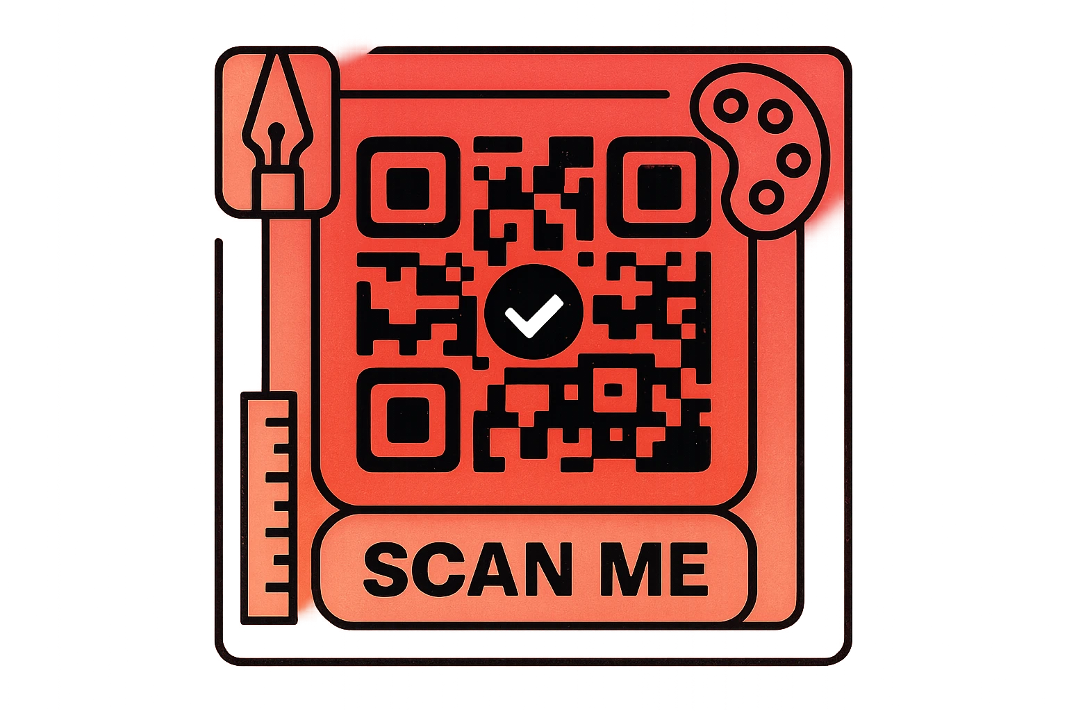
Why QR Code Design Matters
Most QR codes look exactly the same: a dense black-and-white square that screams "machine-readable" rather than "brand experience." That is a missed opportunity. A well-designed custom QR code does three things a generic code cannot: it captures attention, communicates trust, and drives more scans.
First impressions count. When someone sees a QR code on your packaging, poster, or business card, they make an instant judgment about whether it is worth scanning. A plain, generic code blends into the background. A branded QR code with your colors, logo, and a clear call-to-action stands out and tells the viewer that a real, professional organization is behind it.
Brand trust drives scans. People are increasingly cautious about scanning unknown QR codes due to phishing and scam concerns. A code that visually matches your brand — using your company colors, featuring your logo, and sitting inside a branded frame — signals legitimacy. It says, "This is from us, and it's safe to scan."
Scan rates increase measurably. Studies consistently show that branded QR codes receive 30–50% more scans than their generic counterparts. The combination of visual appeal and perceived trust creates a powerful incentive. When you invest in QR code design, you are not just making things prettier — you are directly improving the performance of every printed material, product label, and marketing campaign that features a code.
The challenge, of course, is that QR codes are functional objects. Push the design too far and the code stops scanning. This guide walks you through every aspect of custom QR code design — from color selection and logo placement to module shapes and print preparation — so you can create codes that are both beautiful and reliable. For foundational knowledge about how QR codes work, see our complete QR code guide.
Custom QR code design is not just cosmetic. Branded codes build trust, capture attention, and generate 30–50% more scans than generic black-and-white codes. The goal is to maximize visual impact without compromising scannability.
Core Design Principles
Before you start customizing colors and adding logos, you need to understand the four non-negotiable principles that keep a beautiful QR code functional. Break any of these rules and your code may fail to scan — no matter how good it looks.
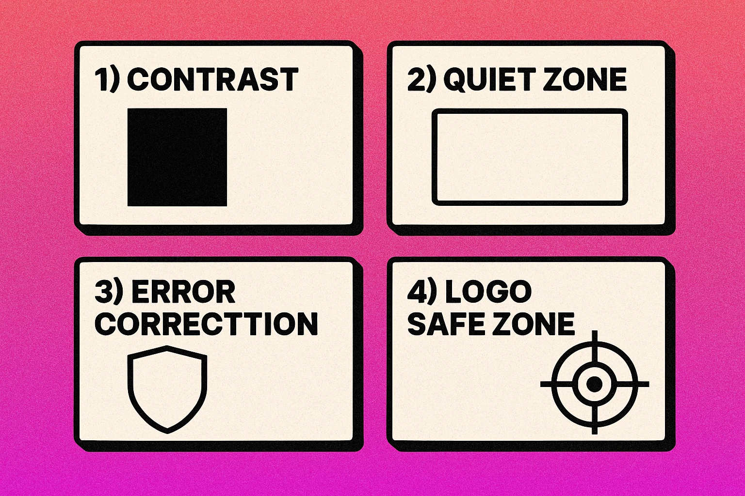
1. Contrast Is King
QR scanners work by detecting the difference between dark and light modules. The higher the contrast between your foreground (modules) and background, the more reliably the code scans. The minimum recommended contrast ratio is 4:1, but aiming for 7:1 or higher is safer, especially for codes that will be scanned in varied lighting conditions. Dark modules on a light background is the standard pattern that every scanner expects.
2. Respect the Quiet Zone
The quiet zone is the blank border surrounding your QR code. It must be at least four modules wide on all sides. This margin tells the scanner where the code ends and the background begins. Cropping into the quiet zone or placing design elements too close to the code edge is one of the most common causes of scan failures.
3. Use Appropriate Error Correction
Every QR code includes redundant data that allows it to be read even when partially damaged or obscured. There are four error correction levels: L (7%), M (15%), Q (25%), and H (30%). If you plan to add a logo or use heavy styling, always use Level H. This gives you a 30% damage tolerance — enough headroom for a centered logo plus minor visual modifications.
4. Maintain Module Clarity
Each module (individual square) in a QR code must be clearly distinguishable from its neighbors. When modules bleed together, merge at the edges, or become ambiguous due to extreme styling, the scanner cannot determine their state. Keep module boundaries crisp and avoid effects like heavy blur, gradient fills across individual modules, or transparency that reduces definition.
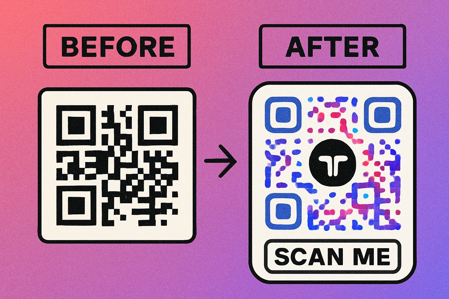
Adding Your Logo to a QR Code
Placing a logo in the center of a QR code is the single most popular customization — and the one most likely to break scannability if done incorrectly. The technique works because QR codes have built-in error correction that can compensate for the obscured modules, but there are strict limits.
The safe zone. Your logo should occupy no more than 20–25% of the total QR code area. The center of the code is the safest placement because it avoids the three finder patterns in the corners and the timing patterns along the edges — all of which are critical for scanning. A logo that covers more than 25% pushes beyond even Level H error correction capacity.
Error correction level H is mandatory. When adding a logo, always generate your code with error correction set to H (30% recovery). Lower levels do not provide enough redundancy to compensate for the modules your logo covers. Some generators handle this automatically; others require you to set it manually.
Size and clarity. Keep your logo simple at small sizes. Detailed logos with thin lines or small text become unreadable when scaled down to fit inside a QR code. Use a simplified version of your mark — an icon or lettermark — rather than a full wordmark. A solid background behind the logo (white or your brand color) with a small padding border helps separate it from the surrounding modules.
For a complete step-by-step walkthrough with visual examples, read our dedicated guide on how to add your logo to a QR code.
Always test your logo QR code on at least three different devices (iPhone, Android, tablet) in both bright and low-light conditions before sending to print. A code that scans on your phone may fail on older devices.
Choosing Colors That Scan
Color is the fastest way to make a custom QR code feel branded, but it is also the easiest way to break scannability. QR scanners are built to detect dark patterns on light backgrounds, so every color decision must respect that fundamental assumption.
The Dark-on-Light Rule
Your foreground modules (the "dots") must always be darker than the background. This is non-negotiable. Inverting the pattern — light modules on a dark background — causes most phone cameras to fail because their QR detection algorithms assume the standard orientation. Some modern scanners handle inverted codes, but many do not, so you cannot rely on it.
Contrast Ratios and Brand Colors
Not every brand color works as a QR code foreground. Yellows, light oranges, pastels, and any color with low luminance contrast against white will fail. Test your chosen color pair using a contrast ratio calculator — you need at least 4:1 for reliable scanning. Safe choices for module colors include dark navy, forest green, burgundy, dark purple, and charcoal. For the background, white or very light tints work best.
Gradient and Multi-Color Approaches
You can apply a gradient across the entire QR code (dark at one end, slightly less dark at the other) as long as every module maintains sufficient contrast against the background at its specific location. Avoid gradients that pass through light colors. Multi-color codes — where different sections use different foreground colors — can work beautifully if each color individually passes the contrast test.
For an in-depth exploration of color combinations that work (and the ones that do not), see our QR code color guide.
Module Shapes and Styles
The standard QR code uses crisp square modules, but modern generators let you replace these with dots, rounded squares, diamonds, and even custom shapes. Changing module style is one of the most visually impactful customizations — it can transform a code from "technical artifact" to "design element."
Dots and circles are the most popular alternative. Replacing square modules with circles softens the appearance of the code and gives it a modern, friendly feel. Because circles occupy slightly less area than squares, the contrast between modules and background changes slightly, but well-implemented dot-style codes scan reliably on all devices.
Rounded squares offer a middle ground — they maintain most of the visual density of standard modules while softening the corners. This style pairs well with modern brand aesthetics that favor rounded UI elements. It is one of the safest shape modifications because module boundaries remain clearly defined.
Custom patterns (diamonds, stars, hearts, or brand-specific shapes) can be striking but carry higher risk. The more a module shape deviates from a filled square, the more potential ambiguity you introduce at module boundaries. If adjacent custom-shaped modules create visual gaps or overlaps, the scanner may misread them.
Finder patterns (the three large squares in the corners) can also be restyled — rounded, given an outer ring, or modified with custom shapes — but their basic structure must remain recognizable. These patterns are the first thing a scanner looks for, and overly creative modifications can prevent detection entirely.
For visual comparisons and best practices for each style, explore our guide on QR code shapes and styles.
Design Your Custom QR Code Now
Choose your colors, add your logo, pick a module style, and download in PNG or SVG — completely free.
Frames and CTA Text
A QR code frame is a decorative border that wraps around the code, typically with a short call-to-action message like "Scan Me," "Learn More," or "Get 20% Off." Frames serve two purposes: they draw the eye to the code and tell the viewer what to expect when they scan.
Why frames matter. A QR code sitting alone on a page or poster is easy to overlook. People may not realize it is interactive, or they may assume it is decorative. A frame with clear CTA text eliminates ambiguity. It says: "This is a QR code. Here is what happens when you scan it." That context dramatically increases engagement.
Effective CTA text. The best calls-to-action are short (2–4 words), action-oriented, and specific. "Scan for Menu" outperforms "Scan Me" because it sets an expectation. "Get 20% Off" outperforms "Learn More" because it promises value. Match your CTA to the actual destination — misleading text damages trust.
Frame design tips. Keep the frame outside the quiet zone — it should surround the code, not encroach on it. Use your brand colors and fonts for the frame to maintain visual consistency. Simple rectangular or rounded frames work best; overly ornate borders compete with the code for attention. The text should be large enough to read at the expected viewing distance.
For frame templates and detailed implementation guidance, see our article on custom frames and CTA text.
Common Design Mistakes to Avoid
Even experienced designers make errors when customizing QR codes because print and digital design intuition does not always translate to machine-readable codes. Here are the five most common mistakes:
Top 5 QR Code Design Mistakes
Inverting colors. Placing light modules on a dark background is the number-one cause of scan failure in custom codes. Always keep modules darker than the background, even when your brand palette tempts you to reverse the pattern.
Oversized logos. Covering more than 25% of the code area with a logo overwhelms the error correction capacity. Even with Level H, exceeding this threshold makes scanning unreliable, especially on older phones or in poor lighting.
Insufficient contrast. Using brand colors without checking contrast ratios leads to codes that look great on screen but fail in the real world. Pastels, yellows, and light grays as module colors are almost always too faint for reliable scanning.
Cropping the quiet zone. Trimming the white border to save space or placing the code edge-to-edge against other design elements prevents scanners from finding where the code begins. Always maintain at least four modules of clear space on every side.
Using JPEG compression. Saving QR codes as JPEG introduces compression artifacts that blur module edges and reduce contrast. Always use PNG for digital or SVG/PDF for print to maintain crisp, sharp modules.
For a deeper analysis of each mistake with visual examples and fix guides, read our full article on QR code design mistakes to avoid.
Designing for Print vs Screen
A QR code that looks perfect on your monitor may fail when printed on a business card, and a code designed for a billboard may be unnecessarily complex for a website. Print and screen environments have fundamentally different requirements.
Print: DPI and Physical Size
For print, resolution is everything. Export your QR code at a minimum of 300 DPI (dots per inch) to ensure crisp module edges. At lower resolutions, the boundaries between black and white modules become fuzzy, reducing scannability. For large-format printing (banners, posters), you can reduce to 150 DPI because the viewing distance is greater, but always test a print sample before committing to a full run.
Minimum physical size depends on the data density. A simple URL code works at 2 cm × 2 cm. A code with a logo and high error correction needs at least 3 cm × 3 cm. For scanning from more than arm's length, scale up proportionally — the general rule is 10:1 ratio (scanning distance to code size). A code scanned from 1 meter away should be at least 10 cm wide. See our QR code size guide for detailed recommendations by use case.
Screen: Pixels and Responsive Display
For digital display, ensure each module is at least 4–6 pixels wide. On high-density (Retina) screens, double that to 8–12 pixels. Use PNG format for raster display or SVG for responsive scaling. Never let the browser scale a QR code below the minimum module size, as anti-aliasing will blur the edges.
Format Selection
Use SVG or PDF for print — they are vector formats that scale infinitely without losing quality. Use PNG for web and digital screens. Avoid JPEG entirely for QR codes. For a comprehensive comparison of export formats, see our guide on QR code file formats and our deep dive on print resolution and DPI.
| Format | Best For | Scalable | Lossy |
|---|---|---|---|
| SVG | Print, responsive web | Yes | No |
| Print production | Yes | No | |
| PNG | Web, email, social | No | No |
| JPEG | Not recommended | No | Yes |
Brand Consistency
A truly branded QR code is not just a code with your logo slapped in the center. It is a design element that feels like a natural extension of your visual identity — matching your typography, color palette, and design language across every touchpoint.
Color alignment. Use your primary or secondary brand colors for the code modules, ensuring they pass the contrast test. If your primary brand color is too light (e.g., a bright yellow or pastel), use a darker secondary color or a dark tint of your primary. The background should match or complement the surface the code appears on — white for clean packaging, a light brand tint for marketing materials.
Consistent module style. If your brand uses rounded, modern design elements (think rounded buttons, soft UI), use rounded or dot-style modules. If your brand is sharp and geometric, stick with square modules or angular custom shapes. This visual consistency makes the QR code feel intentional rather than bolted on.
Frame and CTA typography. Use your brand typeface (or a close match) in the frame text. Match the weight and style of your brand — if your identity uses bold, uppercase type, your QR code frame should do the same. If your brand voice is casual, write the CTA accordingly ("Tap to see more" vs. "SCAN NOW").
Create a QR code style guide. For organizations that use QR codes frequently (across packaging, print ads, events, and digital), create a simple one-page specification that defines the approved module colors, logo placement, frame design, minimum size, and file format. This ensures consistency whether the code is created by your marketing team, a print vendor, or an external agency.
For a comprehensive framework on building QR codes that match your brand identity, see our guide on QR code brand identity.
Brand consistency is the difference between a QR code that looks like an afterthought and one that reinforces your identity at every touchpoint. Align your code's colors, shapes, and framing with your broader visual language, and document the standards so every team member follows them.
Frequently Asked Questions
Yes. Use error correction level H (which recovers up to 30% damage) and place your logo in the center of the code, covering no more than 20–25% of the total area. The center is safest because it avoids the finder patterns in the corners. Always test the code after adding your logo.
The most important rule is dark modules on a light background. QR scanners expect this contrast pattern. Dark blue, dark green, dark red, or black modules on white or light-colored backgrounds work well. Avoid light-on-dark (inverted) codes, yellow or pastel modules, and low-contrast combinations.
For print, the minimum recommended size is 2 cm × 2 cm (about 0.8 inches) for simple codes at close scanning distance. More complex codes with logos need to be larger — typically 3 cm × 3 cm minimum. On screens, ensure each module is at least 4–6 pixels wide. Always factor in viewing distance: a billboard QR code needs to be much larger than one on a business card.
Minimal customization (brand colors, slight shape changes) has negligible impact on scan speed. However, heavy customization — extreme color choices, oversized logos, or highly distorted module shapes — can slow recognition or cause scan failures. The key is maintaining sufficient contrast and keeping the finder patterns and quiet zone intact.
Use SVG or PDF for print — they are vector formats that scale to any size without losing sharpness. Use PNG for digital screens and websites. Avoid JPEG for QR codes because its lossy compression blurs the sharp edges between modules, which can reduce scannability. For high-resolution print work, export at 300 DPI minimum.