Can You Change QR Code Colors?
Yes — QR codes do not have to be black and white. You can change both the module color (the dark squares that form the pattern) and the background color to match your brand, your packaging, or your creative vision. Colored QR codes are used successfully on everything from business cards and product labels to billboards and social media posts.
But there is a catch. QR code scanners rely on contrast — the difference in lightness between the modules and the background — to detect and decode the pattern. Change the colors carelessly, and the code becomes partially or completely unscannable. The technology does not care what hue you use; it only cares about how much the dark parts stand out from the light parts.
This means the creative freedom is real but conditional. You can use navy blue, forest green, deep red, or almost any dark color for your modules, and you can tint your background with soft pastels or warm creams. What you cannot do is pair two colors that are close in luminance (perceived brightness) — even if they look visually distinct to the human eye. For a broader overview of QR code customization options, see our complete guide to custom QR code design.
You can absolutely use colored QR codes. The only rule that matters is contrast: the modules must be significantly darker than the background. Get that right and your QR code will scan as reliably as a standard black-and-white one.
The Golden Rule: Dark Modules on Light Background
Every QR code scanner — from the built-in camera apps on iPhone and Android to dedicated scanning apps — works by detecting the contrast between dark modules and a lighter background. The software converts the camera image into a high-contrast binary grid: dark areas become 1s, light areas become 0s. This is the fundamental decoding mechanism, and it dictates the single most important rule of QR code color:
Always keep your modules (foreground) darker than the background.
This is not a suggestion or a best practice — it is how the technology works. Scanners are specifically calibrated to look for dark patterns on light surfaces. When you reverse this relationship (light modules on a dark background), you are working against the scanner's expectations. Some modern apps can handle inverted codes, but many cannot, and you will lose a significant portion of your audience.
Why Luminance Matters More Than Hue
The human eye is excellent at distinguishing between different hues — red looks obviously different from green, even when both are at similar brightness levels. But QR code scanners do not see hue the way we do. They convert the image to grayscale and then look for contrast in luminance (the perceived brightness of a color).
This means two colors that look completely different to your eye — like red (#FF0000) and green (#00AA00) — can have very similar luminance values, making them nearly indistinguishable to a scanner. Conversely, dark navy (#1B2A4A) on white (#FFFFFF) looks subtle and elegant to you, but to the scanner, it is a high-contrast, easily readable pattern.
If your QR code is not scanning after you have changed its colors, the problem is almost always a luminance issue. See our QR code not scanning troubleshooting guide for step-by-step fixes.
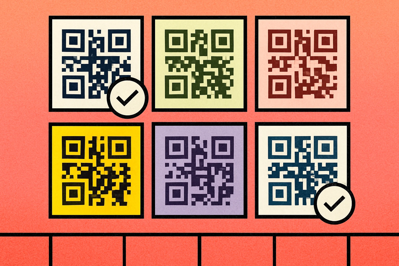
Color Combinations That Work
The following qr code color combinations have been tested across multiple devices and scanning apps. Each maintains a contrast ratio well above the 4:1 minimum and produces reliably scannable codes. Use these as starting points for your own designs.
| Combination | Module (Foreground) | Background | Contrast Ratio | Scannable? |
|---|---|---|---|---|
| Classic | #000000 | #FFFFFF | 21:1 | Yes |
| Dark Navy | #1B2A4A | #FFFFFF | 14.5:1 | Yes |
| Forest Green | #1A5C2E | #FFFFFF | 8.9:1 | Yes |
| Burgundy | #6B1D35 | #FFFFFF | 10.2:1 | Yes |
| Charcoal on Cream | #2D2D2D | #FFF8E7 | 15.8:1 | Yes |
| Deep Purple | #2E1065 | #FFFFFF | 14.1:1 | Yes |
| Dark Teal | #134E4A | #F0FDFA | 9.3:1 | Yes |
| Espresso | #3E2723 | #FFFDE7 | 13.4:1 | Yes |
| Navy on Soft Blue | #0D1B2A | #E0F2FE | 16.2:1 | Yes |
| Dark Rose | #831843 | #FFF1F2 | 9.7:1 | Yes |
Notice the pattern: every working combination uses a dark, saturated foreground against a light, near-white background. You have plenty of room to express your brand identity within these constraints. Dark blues, greens, reds, purples, and browns all work beautifully — just keep the background light.
For more ideas on designing visually striking QR codes, see our guide on QR code styles and shapes and how to add a logo to your QR code.
Color Combinations to Avoid
Knowing what does not work is just as important as knowing what does. These are the most common QR code color mistakes that lead to scan failures.
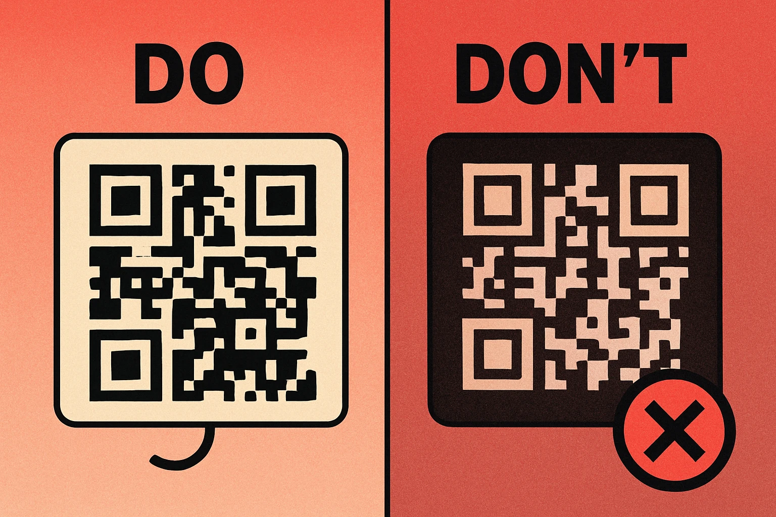
Inverted Colors (Light on Dark)
White or light-colored modules on a black or dark background. While some apps handle this, it is the single most common cause of scan failure with colored codes. The QR specification assumes dark-on-light, and built-in camera apps in iOS and Android are optimized for that assumption.
Low-Contrast Pairings
Colors that are close in luminance, even if they differ in hue. Common offenders include:
- Red modules on green background — similar luminance despite different hues
- Light blue modules on white background — insufficient luminance gap
- Yellow modules on white background — yellow has very high luminance
- Orange on light yellow — both colors sit in the high-luminance range
- Gray modules on slightly darker gray — barely distinguishable in grayscale
Gradient Modules
Applying a gradient directly to the modules means some portions of the code will have high contrast while others fade to dangerously low contrast. The scanner reads the entire code, and if any region falls below the minimum threshold, the decode can fail. Gradients on the background are safer, provided the lightest point still contrasts well with the modules.
Transparent or Semi-Transparent Modules
Some designers apply opacity to QR code modules to achieve a "watermark" look. This directly reduces contrast and makes the code unreliable. If you need a subtle QR code, use a slightly lighter dark color rather than reducing opacity.
Always test your colored QR code on at least three different devices (iPhone, Android, and a tablet) before printing. What scans perfectly on one device may fail on another. Test in different lighting conditions as well — a code that works indoors may struggle in direct sunlight.
Understanding Contrast Ratios
Contrast ratio is the mathematical measurement of the luminance difference between two colors. It is expressed as a ratio like 4.5:1 or 21:1. The higher the number, the greater the contrast and the easier your QR code will be to scan.
The WCAG Standard
The Web Content Accessibility Guidelines (WCAG) define contrast ratio thresholds for text readability. These same thresholds provide an excellent framework for QR codes:
| Contrast Ratio | WCAG Level | QR Code Scannability |
|---|---|---|
| Below 3:1 | Fails | Will not scan on most devices |
| 3:1 – 4:1 | AA Large | Risky — may fail in poor lighting |
| 4.5:1 – 7:1 | AA | Scans reliably in most conditions |
| 7:1 and above | AAA | Excellent — scans in all conditions |
For QR codes, we recommend a minimum contrast ratio of 4:1, with 7:1 or higher as the target for codes that will be printed, used outdoors, or scanned at a distance. The classic black-on-white QR code has a ratio of 21:1 — the maximum possible — which is why it is so forgiving of poor lighting, dirt, and damage.
How to Check Your Contrast Ratio
You do not need to calculate this manually. Free online tools like WebAIM's Contrast Checker allow you to enter two hex codes and instantly see the contrast ratio. Simply enter your module color and your background color. If the result is below 4:1, choose a darker foreground or a lighter background.
Many QR code design tools now show a contrast warning when your color combination falls below safe thresholds. Our own free QR code generator lets you preview your color choices in real time so you can verify scannability before downloading.
Test Your Color Combo — Create a Free QR Code
Pick your custom colors, preview the QR code in real time, and download PNG or SVG instantly.
How to Match Brand Colors to Your QR Code
One of the main reasons people color their QR codes is to align with brand identity. The good news is that most brand color palettes can work — you just need to use them strategically.
Steps to Brand-Match Your QR Code
Identify your darkest brand color. Look at your brand palette and find the color with the lowest luminance value. This is your best candidate for the module color. Dark blues, greens, and reds work well. If your brand uses only light or pastel colors, use black or near-black modules instead.
Check the contrast ratio. Use a contrast checker to compare your chosen module color against white or your intended background color. If the ratio is below 4:1, darken the module color by 20–30% while staying within your brand family. A darker shade of your brand color still reads as on-brand.
Keep the background light. White is always safe. If you want a tinted background, use a very pale version of your brand color (5–10% opacity over white). Avoid medium-tone backgrounds — they eat into your contrast budget.
Use brand colors for accents, not modules. If your primary brand color is too light for modules, use it for the frame or border around the QR code, a call-to-action banner, or a logo placed in the center. This keeps your branding visible without compromising scannability.
Test on real devices. Generate the QR code, display it on screen and on paper, and scan it with at least three different phones. If it fails on any device, increase your contrast. Never approve a colored QR code for print based solely on how it looks on your monitor.
When Your Brand Color Won't Work as Modules
Some brands have primary colors that are simply too light for QR code modules — think Snapchat yellow, Spotify green at full brightness, or any pastel palette. In these cases, your options are:
- Use a dark variant of the brand color (e.g., Spotify dark green #1A5C2E instead of #1DB954)
- Use black modules with a brand-colored background (as long as the background remains light)
- Surround the QR code with brand elements rather than coloring the code itself
- Add a brand-colored frame with a CTA like "Scan Me" beneath the code
The goal is to keep the QR code functional while placing your branding in the areas around and beside it. For more detailed guidance, see our complete QR code guide which covers design, sizing, and placement best practices.
If you are embedding a logo in the center of your QR code, remember that the logo occupies space that would otherwise be used for data and error correction modules. Use error correction level H (30%) to compensate, and keep the logo to no more than 20% of the total QR code area. A dark logo on a light QR code center works best.
Frequently Asked Questions
QR codes can be any color as long as there is sufficient contrast between the dark modules (foreground) and the light background. The minimum recommended contrast ratio is 4:1. Dark modules should always be darker than the background — never invert this relationship, or most scanners will fail to read the code.
Inverted QR codes (light modules on a dark background) are unreliable. While some modern scanner apps can read them, many built-in camera apps on both iOS and Android struggle with inverted codes. For maximum compatibility, always keep your modules darker than the background.
The most universally scannable QR code is black modules on a white background — the classic look. However, dark navy (#1B2A4A) on white, dark green (#1A5C2E) on white, or dark burgundy (#6B1D35) on white all scan just as reliably while adding a branded feel. The key is maintaining high contrast, not the specific color.
In most cases, no. As long as the contrast ratio between modules and background meets the minimum 4:1 threshold, colored QR codes scan just as quickly as black-and-white ones. Scanning speed only degrades when contrast is low or when gradient effects make module edges ambiguous.
Gradients on the background are generally safe as long as contrast remains high across the entire code. Gradients applied to the modules themselves are risky — if the gradient causes some modules to become too light, those areas will fail to scan. If you must use a gradient on modules, keep it subtle and test thoroughly with multiple devices.