Beyond the Classic Square
The classic QR code — a grid of solid black squares on a white background — is functional, universal, and instantly recognisable. But it wasn't designed with aesthetics in mind. For brands, marketers, and designers who need a QR code that fits a visual identity, the rigid black-and-white grid can feel out of place.
Fortunately, the QR code standard is more flexible than it looks. The specification defines the data encoding rules rigorously, but it leaves room for visual customisation at the module level. A module only needs to be distinguishable from its background — it doesn't have to be a perfect square. This is the loophole that enables qr code styles and shapes beyond the default.
Modern QR generators expose style controls that let you change the shape of individual data modules, the look of the three corner finder squares, and the overall geometry of the code. For a complete overview of custom QR code design including colours, logos, and frames, see our pillar guide. This article focuses specifically on module shapes and structural styles.
QR code "style" refers to the visual shape of individual modules (the small squares that form the data grid) and the appearance of the three corner finder patterns. Changing these shapes is cosmetic, but it must be done carefully to preserve scannability.
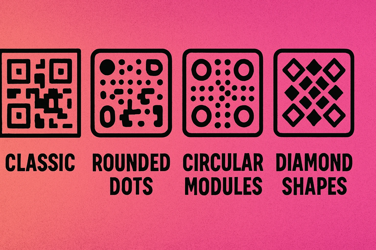
Popular QR Code Module Styles
Most professional QR generators offer four or more module shape options. Each creates a distinct visual character while encoding data identically to the standard square format.
| Style | Shape Description | Visual Feel | Scan Reliability | Best For |
|---|---|---|---|---|
| Square | Standard solid squares, sharp corners | Technical, classic | Excellent | All use cases |
| Rounded | Squares with smoothed corners, modules blend at edges | Soft, modern | Very good | Consumer brands, apps |
| Dots | Circles replacing each module, gaps between them | Airy, contemporary | Very good | Marketing, packaging |
| Diamond | 45° rotated squares creating a faceted look | Geometric, premium | Good | Luxury goods, events |
| Vertical bars | Tall thin rectangles, column-oriented | Structured, editorial | Good | Print media, posters |
| Horizontal bars | Wide thin rectangles, row-oriented | Minimal, flat | Good | Print media, posters |
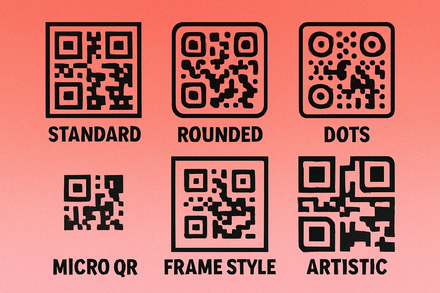
Square (Default)
The original. Square modules with sharp 90° corners are the most reliably decoded shape across every scanning environment — dim lighting, motion blur, worn surfaces, and low-resolution cameras alike. If in doubt, start here. There's no performance advantage to any other style, only an aesthetic one.
Rounded
Rounded modules keep the basic square footprint but smooth the corners to a soft radius. Adjacent modules may visually merge at their edges, creating a more flowing, organic appearance. This is the most popular styled option because it reads almost as reliably as the square default while looking noticeably more refined. It pairs well with colour combinations and logo overlays.
Dots
Each module becomes a circle slightly smaller than the module cell, leaving visible gaps between elements. The result is a lighter, airier pattern that feels less dense than the classic grid. Dot-style codes work well on backgrounds with texture or gradient because the gaps reduce the visual "weight" of the code. The trade-off is that very small print sizes may cause the dots to become too tiny for reliable scanning — keep minimum print size at 2 cm × 2 cm (0.8 inches).
Diamond
Diamond modules are squares rotated 45 degrees. The result is a faceted, jewel-like texture that reads as distinctly premium. Diamonds are less commonly supported in free tools and require higher-contrast colour settings to scan reliably, but they're highly effective for luxury products, event materials, and editorial design.
Finder Pattern Customisation
The three large squares in the corners of every QR code — the finder patterns — are the most visually dominant element of the design. Modifying them has a bigger impact on the overall look than changing the data modules alone.
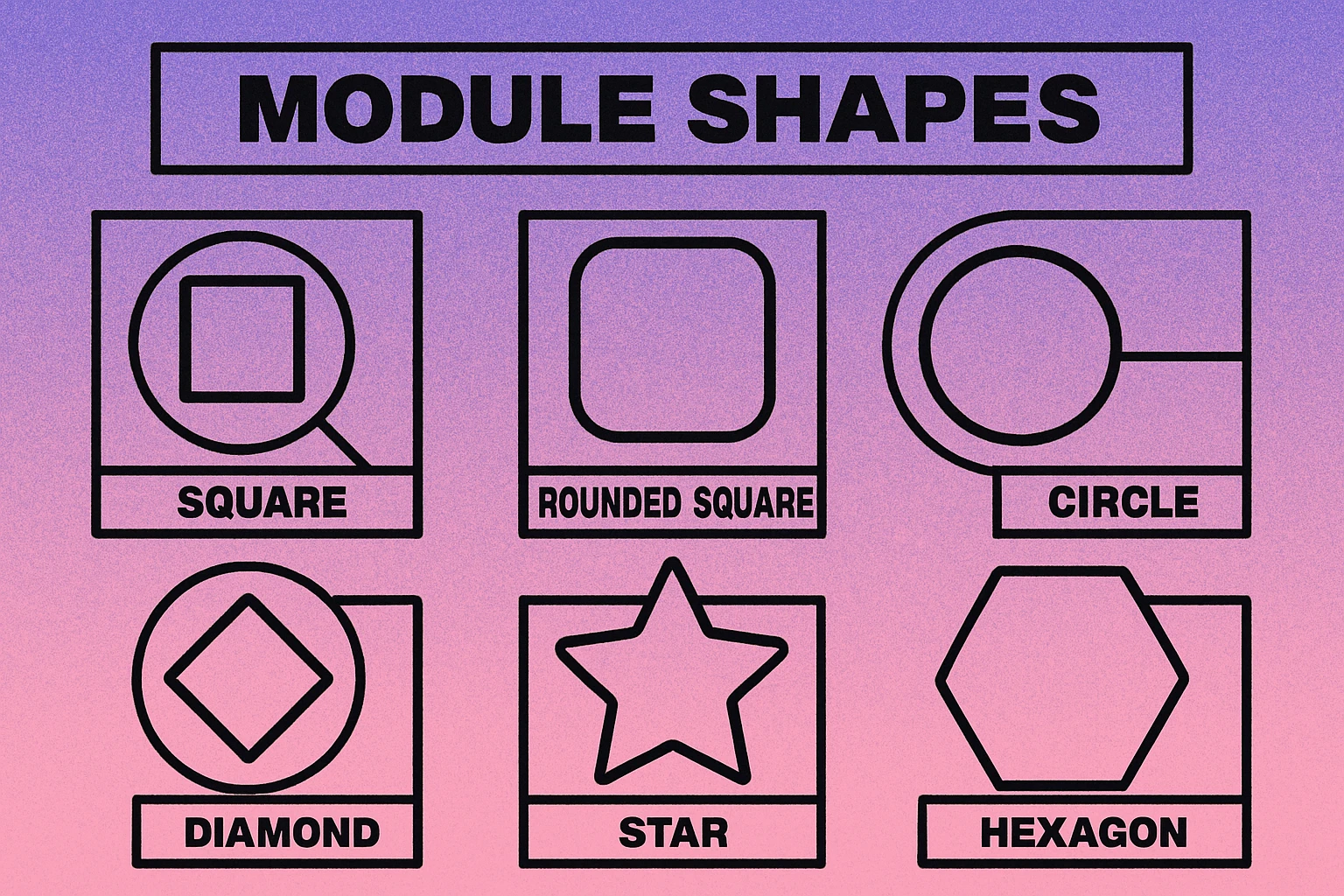
Finder patterns have two parts: the outer frame (the thick border square) and the inner eye (the filled square in the centre). Most generators let you control each independently. Common options include:
- Square outer / square inner: Standard default. Maximum compatibility.
- Rounded outer / square inner: The most common styled variant. Feels modern without sacrificing scan reliability.
- Rounded outer / rounded inner (full round): Completely soft corners. Widely supported by modern scanners.
- Circular eye: The inner square is replaced by a circle. Works well with dot-module styles for a cohesive circular aesthetic.
- Leaf / teardrop shapes: Decorative shapes for the outer frame. Use cautiously — test thoroughly before deploying.
Scanners use finder patterns to locate and orient the QR code. If the outer frame shape is too irregular, some older or lower-quality scanners may fail to find the code at all. Rounded corners are safe. Heavily abstract shapes are not. Always test on both iOS (Camera app) and Android (Google Lens) before printing.
For an in-depth look at how shape interacts with frame design and call-to-action borders, see our article on custom frames and CTA design for QR codes.
When Custom Styles Help
Styled QR codes aren't just decorative. In the right context, they actively improve performance by increasing the likelihood that someone will actually scan the code.
Brand Consistency
A QR code printed on a premium product that uses a rounded dot style with brand colours looks intentional and considered. A raw black-and-white grid on the same product looks like an afterthought. When your audience already associates visual polish with quality, a styled QR code reinforces that signal. Pair it with your brand palette using the guidance in our colour combinations guide.
Marketing Materials
Flyers, banners, business cards, and social media graphics benefit from QR codes that match the surrounding design language. A dot-style QR code in a poster's accent colour draws the eye without disrupting the layout. A standard black square can feel jarring if the rest of the design is soft and typographic.
Consumer-Facing Packaging
Product packaging is scanned by consumers choosing to engage, not by automated systems. A rounded, on-brand QR code on a cosmetics box or food product signals care and intentionality. Combine it with a logo embedded in the centre for maximum brand recognition.
Digital Surfaces
QR codes displayed on screens — in email signatures, on presentation slides, or in digital ads — are scanned in ideal conditions (high resolution, backlit display). This is where more decorative styles like diamonds or mixed finder shapes can be used more freely, since the scan environment is controlled.
When to Stick with Standard
Custom styles are not appropriate for every use case. In several contexts, the default square style is not just better — it's the only sensible choice.
Try Styled QR Codes for Free
Choose dots, rounded, or classic square. Add your brand colours and download instantly — no account needed.
Industrial and Logistics Use
Warehouse labels, shipping cartons, and inventory tags are scanned by handheld industrial scanners and fixed-beam readers under varying conditions — motion, dirt, partial damage, and poor lighting. These devices are optimised for the standard square format. Non-standard module shapes add risk without benefit. Keep it square, keep it high contrast, keep it working.
Authentication and Security Contexts
Event tickets, boarding passes, and document verification codes are typically scanned quickly in high-throughput settings (gates, checkpoints). The scanner speed and ambient conditions (outdoor events, moving crowds) favour maximum reliability. Use the default square style and focus on error correction level and quiet zone instead.
Small Print Sizes
When a QR code is printed smaller than about 2 cm × 2 cm (roughly the size of a large stamp), dot and diamond styles can become unreliable. The gaps between dot modules shrink to sub-millimetre widths that low-resolution cameras may misread as solid. At small sizes, rounded or square modules are much safer. See our full guide on QR code best practices for minimum size recommendations by use case.
Technical Documentation
Data sheets, compliance labels, and technical manuals are read by a wide range of scanning devices, including very old or basic models. Using a standard square ensures the broadest possible compatibility across every scanner your document might encounter over its lifetime.
Best Practices for Styled QR Codes
Whether you're using dots, rounded corners, or diamond shapes, the following principles apply universally. Follow them and your styled QR code will scan as reliably as any standard one.
Six Rules for Styled QR Codes
Always test before you print. Generate the final styled code and scan it with at least three devices: an iPhone (native Camera app), an Android phone (Google Lens or native camera), and a dedicated QR scanner app. Test in average room lighting, not just perfect conditions.
Maintain high contrast. The minimum recommended contrast ratio between modules and background is 3:1, but 4.5:1 or higher is safer for styled codes where module edges are softer. Dark modules on a light background always outperform light on dark for scanner reliability. Read our colour guide for safe combinations.
Keep the finder patterns recognisable. Rounded finder corners are fine. Completely abstract or irregular finder shapes are not. The scanner needs to reliably identify the three corner elements to orient the code. When in doubt, use rounded-outer / rounded-inner and leave the rest of the customisation to modules and colour.
Use error correction level H for styled codes. Error correction level H allows up to 30% of the code to be reconstructed. Styled modules can introduce minor ambiguities in edge detection; higher error correction compensates. This is especially important if you're also adding a logo overlay. See our pillar guide on custom QR code design for more on balancing error correction with logo size.
Preserve the quiet zone. The blank border around the QR code must be at least four module widths wide — regardless of style. Cropping the quiet zone causes scan failures more reliably than any module shape change.
Avoid common design mistakes. Low-contrast colour pairs, overly small print sizes, missing quiet zones, and overly decorative finder patterns are the most frequent causes of scan failure in styled QR codes. Our article on design mistakes to avoid covers each failure mode in detail.
Dot and rounded styles are safe for consumer-facing and marketing use when contrast is maintained and finder patterns remain clear. Diamond and bar styles are more decorative and need careful testing. For industrial, logistics, authentication, and small-print contexts, stick with the classic square. Always test on real devices before printing at scale.
Frequently Asked Questions
Yes, they can — but when done correctly, the impact is minimal. Dot, rounded, and diamond module styles are all recognised by modern smartphone cameras and QR scanners. The key is maintaining sufficient contrast between modules and background, keeping the quiet zone intact, and leaving the finder patterns clearly visible. Always test your styled code with multiple devices before printing at scale.
The classic square module style is the most reliably scannable across all devices and scanning conditions, including low light, motion, and worn surfaces. Rounded and dot styles perform nearly as well in standard consumer contexts. For industrial, logistics, or high-speed scanning scenarios, stick with the square default.
Yes. Many QR generators allow you to round the corners of finder pattern squares or replace them with custom shapes. Rounded finder patterns are widely supported, but heavily abstract or irregular shapes can confuse some scanners. If you customise finder patterns, test on both iOS and Android before deploying.
In dot style, each module is replaced by a circle that does not touch its neighbours — the modules are visually separate. In rounded style, the square modules have their corners smoothed to create a soft, continuous look where adjacent modules blend together. Dot style looks more scattered and modern; rounded style appears more flowing and organic. Both work well for branding use cases.