Why QR Code Design Mistakes Matter
Every failed scan is a lost opportunity. When a customer points their phone at your QR code on a poster, packaging, or menu and nothing happens, they don't investigate why — they move on. That moment of friction translates directly into lost engagement, lost sales, and lost conversions. And unlike a broken link you can trace in analytics, a scan failure leaves no trace at all.
The frustrating reality is that the vast majority of scan failures are entirely preventable. Most result not from technical complexity but from a small set of well-documented QR code design mistakes that violate the fundamental rules of how QR codes are read. Understanding these rules takes minutes; applying them takes seconds.
This guide covers the seven most common reasons QR codes fail to scan, explains the underlying mechanics of why each one breaks the scanning process, and gives you a concrete checklist to verify every QR code before it goes to print or goes live. For the broader context on creating great QR codes, see our custom QR code design guide.
Studies of QR code scan failures consistently show that the top causes are design-related, not technical. A correctly generated code that violates basic design rules will fail just as surely as a corrupt file — often more invisibly.
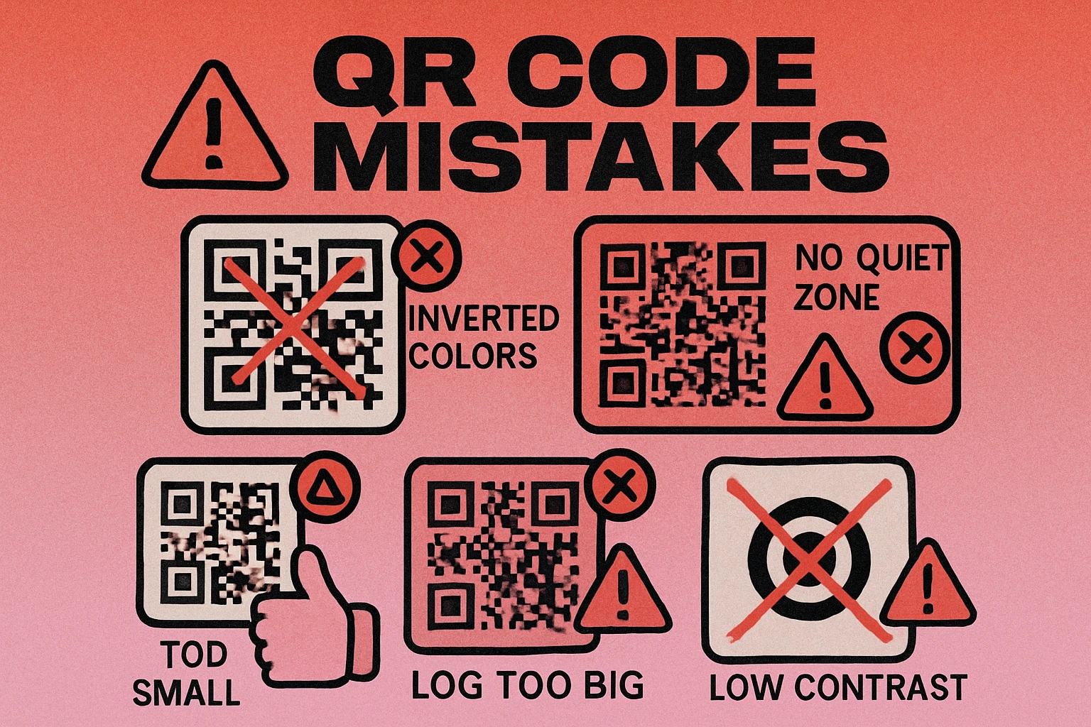
Mistake #1: Inverting Colors
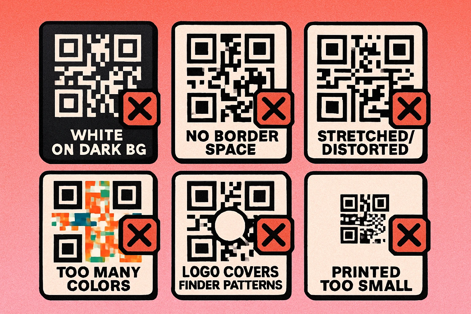
A standard QR code has dark modules on a light background. This is not an aesthetic convention — it is a technical requirement rooted in how camera-based scanners work. QR code readers are designed to identify dark patterns against a light field. When you invert a QR code, placing light modules on a dark background, many scanners simply cannot read it.
The problem is compounded by how cameras meter exposure. A predominantly dark image causes the camera to increase exposure, potentially blowing out the lighter elements and reducing the contrast the scanner needs to distinguish individual modules. While some modern scanners can handle inverted QR codes, many cannot — and you have no way of knowing what scanner your audience is using.
The fix is straightforward: always use dark modules on a light background. If your design requires a dark background, place the QR code inside a light-colored box with sufficient padding, rather than inverting the code itself. This preserves the visual intent of your design while keeping the code reliably scannable.
Dark modules, light background. Always. If your design calls for a dark background, surround the QR code with a white or light-colored container rather than inverting the module colors.
Mistake #2: No Quiet Zone
The quiet zone is the blank white margin that borders the QR code on all four sides. Per the QR code specification, it must be at least four modules wide. This margin is not decorative — it is a functional requirement that tells the scanner where the code ends and the surrounding environment begins.
Without an adequate quiet zone, the scanner cannot reliably locate the finder patterns in the corners of the code. Busy backgrounds, adjacent text, borders, and nearby design elements all bleed into the code's boundaries, causing the scan to fail. This is one of the most common design mistakes made when embedding QR codes into print layouts where designers crop the code edge-to-edge to save space.
Always maintain a minimum quiet zone of four modules on every side. In practical print terms, if your code modules are 1 mm wide, you need at least 4 mm of clear space all around. More is better — a quiet zone of six or eight modules provides a comfortable safety margin, particularly for codes printed on textured materials or dark-tinted surfaces.
Mistake #3: Printing Too Small
Minimum size is one of the most overlooked factors in QR code sizing. There is no universal "minimum QR code size" because the correct minimum depends on two variables: the density of the code and the scanning distance.
A denser QR code — one that encodes more data or uses higher error correction — has smaller individual modules. When printed too small, those modules become indistinguishable to the camera, and the scanner cannot resolve the pattern. The general minimum for close-range scanning (business cards, product labels, table cards) is 2 cm × 2 cm (approximately 0.8 × 0.8 inches).
For codes intended to be scanned from a distance, apply the 10:1 rule: the code should be 1 cm in size for every 10 cm of scanning distance. A code on a poster meant to be scanned from 1 meter away needs to be at least 10 cm × 10 cm. A window sticker scanned from 50 cm away needs at least 5 cm × 5 cm.
You can reduce code density — and therefore allow a smaller print size — by shortening the encoded URL. Use a URL shortener or a short custom domain to reduce the data payload. Fewer characters mean fewer modules, which means the code can be printed smaller while remaining reliably scannable.
Mistake #4: Logo Covering Finder Patterns
Adding a logo to the center of a QR code is a popular and legitimate customization technique — when done correctly. The mechanism that makes it work is error correction: the redundant data built into every QR code allows it to be partially obscured and still decoded. This is covered in detail in our guide to QR code error correction levels.
The critical mistake is placing a logo or overlay that covers any of the three finder patterns in the corners of the code. These large square elements are not covered by error correction — they are structural landmarks that the scanner uses to locate the code and establish its coordinate system. Cover even one finder pattern and the scanner may be unable to orient itself, making the code unreadable regardless of error correction level.
An equally common error is using a logo that is too large. Even centered logos that avoid the finder patterns can fail if they cover too much of the data area. With Error Correction Level H (the highest level, offering 30% recovery), a logo should cover no more than 25–30% of the total code area to leave a safe margin. For codes using Level M or L error correction, keep logos to 10–15% of the area maximum.
For a comprehensive guide to adding branding to QR codes safely, see our article on QR codes with logos.
Mistake #5: Low Contrast Colors
Custom-colored QR codes are visually appealing and on-brand — but only when the QR code color combinations maintain sufficient contrast between the module color and the background color. This is a constraint that many designers underestimate.
Camera-based scanners detect QR codes by identifying the boundary between dark and light regions. If your module color and background color are too similar in luminance — even if they are visually distinct hues — the scanner may fail to distinguish them in varying lighting conditions. A dark purple on a dark navy background that looks distinct on-screen may become indistinguishable under fluorescent office lighting or in a phone camera captured under a dim restaurant light.
The recommended minimum contrast ratio between QR code modules and background is 4:1, based on the WCAG accessibility standard. In practice, aim higher. The safest approach is near-black modules on a white or near-white background. If you use color, ensure the module color is substantially darker than the background — use an online contrast checker to verify before printing.
Also avoid placing your QR code directly on photographic backgrounds or gradients. Color variation in the background makes it impossible for the scanner to establish a consistent threshold for distinguishing module colors, causing erratic read failures.
Mistake #6: Stretching or Distorting
QR codes must be square. The specification is built on a square grid, and the scanner's geometry calculations assume equal module dimensions in both the horizontal and vertical axes. When you stretch a QR code into a rectangular shape — even slightly — the module grid is no longer square, and the scanner's coordinate system breaks down.
This happens most often in layout software when a designer scales a QR code image by dragging a corner handle without holding the aspect-ratio lock. It also happens when a QR code is embedded in a table cell, container, or frame with CSS that stretches the image to fill a non-square space.
Always use constrained scaling: hold Shift when resizing in design applications, or use object-fit: contain in CSS. Check the final dimensions of your QR code before sending files to print. A QR code that is even 5% taller than it is wide will fail to scan on many devices.
Related: any distortion — shearing, perspective warping, skewing — will also cause failures. Alignment patterns help scanners compensate for moderate perspective distortion when photographing a flat surface from an angle, but heavy distortion from design manipulation is not correctable.
Mistake #7: Using Low Error Correction with Customization
Error correction level is the most technically misunderstood factor in QR code design. There are four levels: L (7%), M (15%), Q (25%), and H (30%). The percentage refers to how much of the code can be damaged or obscured while still being readable.
The mistake is applying design customizations — logos, colored overlays, dot patterns, artistic module shapes — to codes generated at Error Correction Level L or M. Low error correction gives the decoder no redundancy to fall back on. Any module that the scanner cannot read clearly because of a stylistic overlay pushes the code past its recovery threshold, and the scan fails.
When you customize a QR code visually, always use Error Correction Level H. This is especially important when:
- Adding a logo, icon, or image overlay to the center of the code
- Using artistic module shapes (dots, rounded corners, stars) that reduce visual clarity at the edges of each module
- Printing on materials with texture, grain, or surface irregularity that may obscure fine details
- Using low-contrast color combinations that may cause some modules to be borderline readable
The trade-off is that Level H codes are denser than Level L codes for the same data payload — they require more modules to store the same information plus the extra redundancy. To offset this, shorten your encoded URL before generating. Read our full breakdown of QR code error correction levels for the complete picture.
Generate a Scannable QR Code — Free
Create custom QR codes with the right error correction, quiet zone, and contrast settings built in. No signup required.
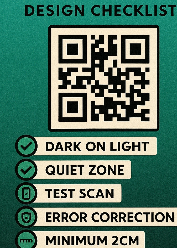
How to Fix Each Mistake: Quick Checklist
Before every QR code goes to print or goes live on a webpage, run through this checklist. It takes less than two minutes and will prevent the vast majority of scan failures.
QR Code Design Pre-Flight Checklist
Color direction. Confirm dark modules appear on a light background. If the design requires a dark background, the QR code must be enclosed in a light-colored box — do not invert module colors.
Quiet zone. Measure or visually verify that at least four modules of clear space exist on all four sides of the code. In print layouts, this means no text, borders, or design elements encroach within that margin.
Minimum size. Verify the printed dimensions against the scanning distance. Minimum 2 cm × 2 cm for close-range; apply the 10:1 rule for distance scanning. Test-print at actual size and scan before approving.
Logo placement. If using a logo overlay, confirm it does not cover any of the three finder patterns in the corners. Confirm the logo covers no more than 25% of the total code area (when using Error Correction Level H).
Contrast ratio. Use a contrast checker to verify a minimum 4:1 ratio between module color and background color. Test the code under poor lighting conditions and on a mobile camera before signing off.
Aspect ratio. Confirm the QR code is perfectly square. Check actual pixel or point dimensions — do not rely on visual inspection alone. Use constrained scaling in all layout software.
Error correction level. If any visual customization has been applied — logo, custom shapes, artistic styling — confirm the code was generated at Error Correction Level H. Regenerate at Level H if uncertain.
One final step that no checklist can replace: scan the actual output. Print a test copy at the intended size and scan it with at least two different phones before sending to final print production. What looks correct on screen can reveal unexpected issues in physical form.
Test your QR code with both the native iOS camera app and a third-party Android scanner. They use different decoding algorithms and have different tolerance thresholds — if both can scan it reliably, you are in good shape for the widest possible audience.
Frequently Asked Questions
The most common mistake is removing or shrinking the quiet zone — the white margin that surrounds the code. Without at least four modules of clear space on all sides, scanners cannot reliably distinguish the code from the background, causing frequent scan failures even with an otherwise perfect QR code.
You can use custom colors, but the dark modules must always be significantly darker than the light modules. A minimum contrast ratio of 4:1 is recommended, and the dark elements should never be lighter than the background. Avoid using two colors of similar lightness, and never invert the code so that light modules appear on a dark background without thorough testing. For inspiration that works, see our guide to QR code color combinations.
A logo or image overlay should cover no more than 30% of the QR code's total area when using Error Correction Level H, which provides up to 30% damage recovery. In practice, keep logos to 20–25% of the code area to leave a comfortable safety margin. Critically, the logo must never cover any of the three finder patterns in the corners of the code. Read our QR code with logo guide for detailed sizing guidance.
The general minimum is 2 cm × 2 cm (about 0.8 × 0.8 inches) for codes scanned at close range, such as on business cards or product packaging. For codes meant to be scanned from a distance — billboards, posters, signage — apply the 10:1 rule: add 1 cm of size for every 10 cm of scanning distance. A code scanned from 1 meter away should be at least 10 cm × 10 cm. Our QR code size guide covers this in full detail.