What Is a QR Code Frame?
A QR code frame is a decorative border or container that surrounds the QR code matrix and typically includes a short line of call-to-action (CTA) text. Think of it as the packaging around the code — the frame provides visual structure, while the CTA text tells the viewer exactly what will happen when they scan.
Without a frame, a QR code is a silent square of black-and-white modules. A viewer has to guess whether it links to a website, a menu, a discount, or something else entirely. A frame resolves that ambiguity instantly. The combination of a recognizable border shape and a clear text prompt transforms a passive graphic element into an active invitation to engage.
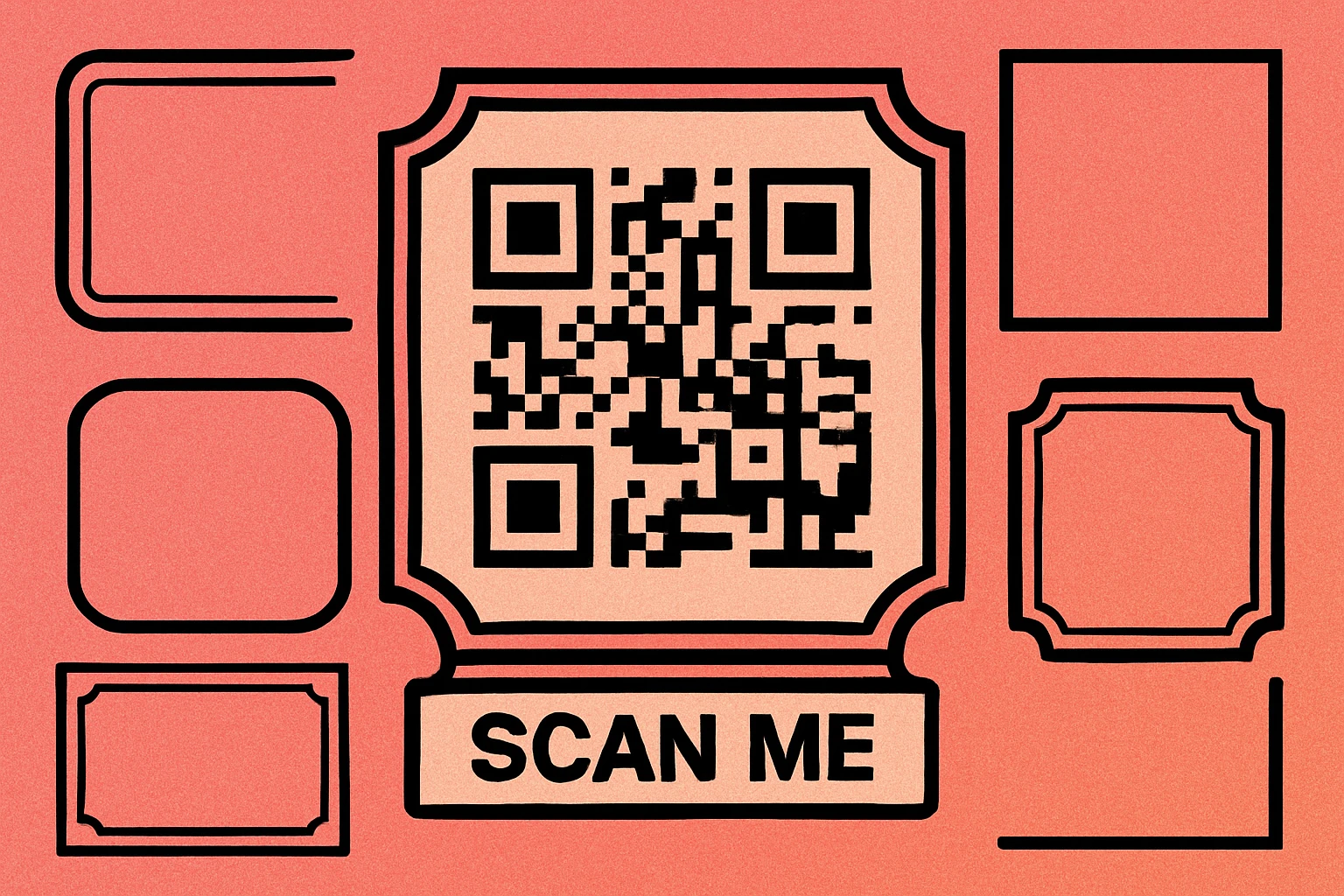
Frames are especially valuable in physical environments — restaurant tables, retail displays, event signage, packaging, and business cards — where you cannot rely on a caption or surrounding copy to explain the code. The frame itself carries the context. For a broader look at how frames fit into the overall visual design of a QR code, see our guide on custom QR code design.
A QR code frame is a decorative border plus optional CTA text that surrounds the code. Its primary job is to communicate intent — telling viewers what they will get when they scan — before they commit to the action.
Why Frames Increase Scan Rates
Several factors explain why framed QR codes consistently outperform bare codes in real-world deployments:
Visual Cue and Boundary
A frame creates a clear visual boundary that separates the QR code from surrounding content. On a busy menu, a cluttered product label, or a wall poster, an unframed QR code can blend into the background. A frame — particularly one with a solid border and contrasting background — creates a focal point that the eye naturally gravitates toward.
Context and Expectation Setting
When someone sees a QR code labeled "Scan for Wi-Fi," they know exactly what will happen. That certainty reduces hesitation. Research on user behavior consistently shows that people are more likely to take an action when the outcome is clearly communicated. A bare QR code offers no such promise, which introduces doubt and friction.
Perceived Professionalism
A framed QR code with branded colors and a clean CTA looks intentional. It signals that someone thought carefully about the experience. This perceived professionalism builds trust, especially in contexts where QR code scams have made consumers more cautious. A well-designed frame communicates legitimacy in a way a raw matrix cannot.
These principles connect directly to QR code color strategy — the frame and the code color should work together as a cohesive visual system, not as separate elements bolted together.
Frame Types
Not all frames are created equal. The right frame style depends on where the QR code will appear, how much space you have, and the visual identity of your brand. Here is a comparison of the four most common frame types:
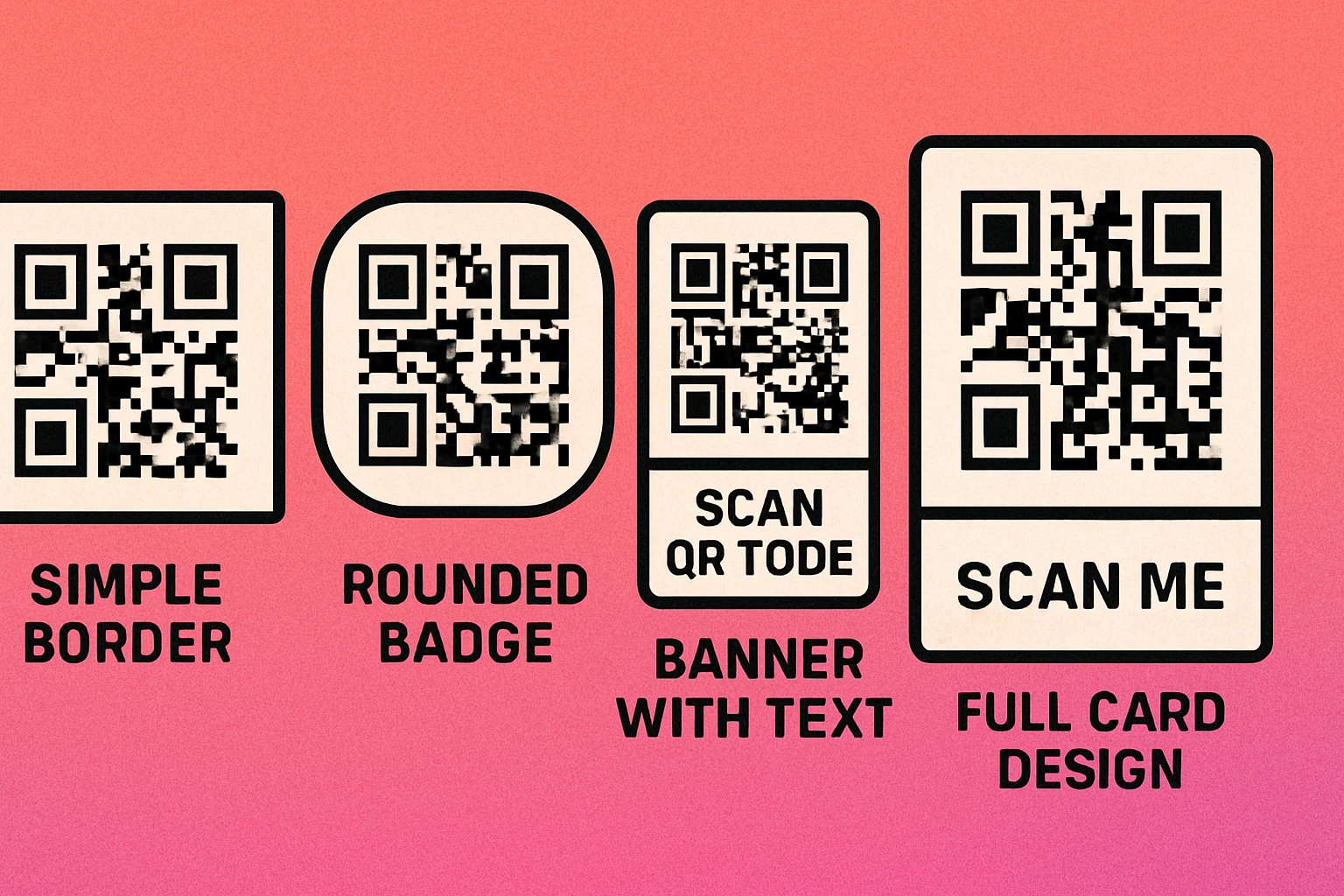
| Frame Type | Description | Best For | CTA Text Placement |
|---|---|---|---|
| Simple Border | Thin or thick rectangular stroke around the code. Minimal visual weight. | Business cards, email signatures, small print spaces | Below or above the code |
| Rounded Badge | Pill or rounded rectangle container with a filled background. Stands out strongly. | Product packaging, stickers, name badges | Below the code inside the badge |
| Banner | Full-width colored strip below (or above) the QR code carrying the CTA text. | Posters, restaurant table cards, window signage | Inside the banner strip |
| Full Card | Complete card layout with header, QR code, CTA text, and optional brand logo. | Flyers, printed handouts, trade show materials | Header and/or footer area of card |
When choosing a frame type, consider the physical context first. A simple border works beautifully on a business card where space is tight, but it will be nearly invisible on a large-format poster. A full card layout is ideal for standalone handouts but is overkill when the QR code appears within a larger designed piece. For guidance on how size interacts with frame choice, see our QR code size guide.
Best CTA Text Examples
The CTA text is the most important part of the frame. It is the one piece of copy that converts a passive viewer into an active scanner. The best CTA text is short, specific, and action-oriented.
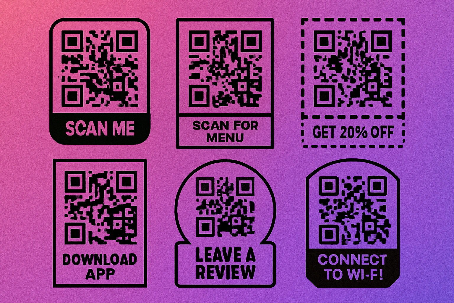
Here are the most effective CTA phrases organized by use case:
General / Universal
- Scan Me — Simple, direct, works in any context
- Scan Here — Slightly more directive, points attention
- Tap or Scan — Useful when NFC is also present
Hospitality and Food
- Scan for Menu — The most scanned hospitality phrase
- View Today's Specials — Creates urgency and curiosity
- Order Here — For self-service ordering flows
- Leave a Review — Effective near checkout or table exit
Retail and E-Commerce
- Get 20% Off — Specific discount, highest motivation
- Shop the Collection — For catalog or campaign pages
- See It in Action — Links to product video
- Check Stock Online — Bridges physical and digital inventory
Events and Marketing
- Register Now — Event registration, workshops
- Watch Demo — Trade shows, product launches
- Download Free Guide — Lead generation campaigns
- Connect on LinkedIn — Networking and professional events
Technical and Utility
- Connect to Wi-Fi — Lobbies, cafes, offices
- Download App — App store download campaigns
- Track Your Order — Post-purchase packaging
Avoid vague phrases like "Learn More" or "Click Here" — these communicate nothing about the payoff. The more specific the CTA, the higher the scan rate. "Get 20% Off" will always outperform "Scan Here" in a retail context.
How to Add a Frame (Step by Step)
Adding a frame to a QR code is straightforward with the right tool. The process below works whether you are using an online generator or a desktop application. The key principle throughout: the frame should enhance the code, not compress or obscure it.
Adding a Custom Frame to Your QR Code
Generate your base QR code. Open the QR code generator at generateonlineqr.com and enter your URL, text, Wi-Fi credentials, or other content. Before adding the frame, set your error correction level to M or H. Higher error correction is important when you plan to add visual elements, because it provides redundancy that keeps the code scannable even if the design partially overlaps the quiet zone.
Choose your frame style. Select from simple border, rounded badge, banner, or full card options. Match the frame shape to the physical context where the code will appear — a badge for a sticker, a banner for a table card, a full card for a flyer. If your tool supports it, set the frame color to match your primary brand color. See our article on QR code styles and shapes for how shape choices interact with frame design.
Enter your CTA text. Type a short, action-oriented phrase of no more than 20 characters. Use title case or all caps for visual weight. Ensure the font is clean and legible — avoid overly decorative typefaces that reduce readability at small sizes. The minimum recommended font size for print is 10pt (approximately 3.5mm) at final output size. For posters and signage, scale proportionally to the viewing distance.
Download and test before publishing. Export your framed QR code as a high-resolution PNG (minimum 1000×1000 px for print) or SVG for fully scalable output. Before printing at scale, scan the code from multiple angles, at different distances, and in varying lighting conditions. Test with at least two different smartphones. If any scan fails, increase the error correction level or increase the overall size of the output. For print-specific guidance, see our QR code print resolution and DPI guide.
Design Your Framed QR Code — Free
Add a custom frame, choose your CTA text, and download a print-ready file in seconds. No account required.
Design Tips for QR Code Frames
A frame can make or break the scannability and professionalism of your QR code. These practical tips help you get both right.
Match the Frame to Your Brand
Use your brand's primary or accent color for the frame border and background fill. Keep the QR code modules dark (ideally black or very dark navy) against a white or very light background inside the frame. Brand consistency increases trust and recognition — a frame that matches the color palette of your packaging or signage looks intentional. For inspiration, read our guide on QR code color combinations that work.
Protect the Quiet Zone
The quiet zone is the white border surrounding the QR code matrix. It must remain unobstructed. A frame should sit outside the quiet zone, never compressing or overlapping it. If you notice that scanning becomes unreliable after adding a frame, the most common cause is a quiet zone that has been reduced or eliminated. The ISO standard requires a minimum of four modules of clear space on all sides.
Keep Font Sizes Legible
CTA text that is too small defeats the purpose of having it. At print size, use a minimum of 10pt (3.5mm). For wall signage viewed from 1–3 meters, scale the text to at least 14–18pt at the final printed size. Choose a clean sans-serif font — the same typeface as your brand is ideal. Avoid script or decorative fonts that reduce legibility at distance.
Test at Actual Print Size
A QR code that scans perfectly at 300px on screen can fail at 2cm in print if the module density is too high. Always print a test copy at the actual intended size and scan it before committing to a full print run. Our QR code size guide explains the minimum size recommendations for different use cases.
Keep It Simple
More design is not always better. A single, high-contrast frame with one clear line of CTA text is more effective than a frame loaded with multiple colors, icons, and text blocks. The QR code itself should dominate the frame — the frame is a supporting element, not a competing one. For a full look at how design decisions affect performance, see our article on common QR code design mistakes to avoid.
Before finalizing: confirm the quiet zone is intact, CTA text is at least 10pt at print size, frame color contrasts with the code background, and you have scanned the final output on at least two different devices.
Frequently Asked Questions
A well-designed frame does not reduce scannability as long as the quiet zone inside the frame remains intact. The frame should sit outside the QR code's required white border, not overlap or compress it. Use error correction level M or H when adding frames, logos, or other design elements to ensure reliable scanning.
The best CTA text is short, specific, and action-oriented. Generic prompts like "Scan Me" work well when context is clear, but targeted phrases like "Scan for Menu," "Get 20% Off," or "Watch Demo" consistently outperform generic ones because they set expectations and create motivation to scan.
CTA text should be at least 10pt (approximately 3.5mm) at final print size to remain legible from a normal viewing distance of 30–50cm. For large-format prints like posters or signage, scale proportionally — the text should be readable at the distance from which someone would realistically notice and scan the code.
Yes. You can apply brand colors to the frame border, background fill, and CTA text. The QR code modules themselves need sufficient contrast against their background — a minimum contrast ratio of 3:1 is recommended. Avoid light-colored modules on a light frame background. The frame color does not need to match the QR code module color.