Why Print Advertising Still Works — and How QR Codes Amplify It
Print advertising never disappeared. It evolved. Billboards command attention at scale, magazine spreads carry authority, flyers drive local action, and posters build brand recall in high-dwell environments. What print lacks by itself — measurability, interactivity, and a direct digital handoff — is exactly what QR codes supply.
When a reader scans a QR code on a poster, that scan is a trackable, attributable event. You know which format drove it, when, and what the visitor did next. This makes QR codes in print advertising one of the most direct ways to close the loop between offline spend and online conversion. For the strategic foundation, see our pillar guide on QR code marketing strategy.
The challenge is execution. A QR code that works perfectly on a web mockup can fail in the real world if it is too small to scan from a typical viewing distance, exported at the wrong resolution, or buried in a busy corner of the layout where no one notices it. This guide covers every variable you need to get right.
Every print format has a natural viewing distance. Your QR code must be large enough to scan comfortably from that distance, specified correctly for the output process, and placed where the reader's eye already wants to look.
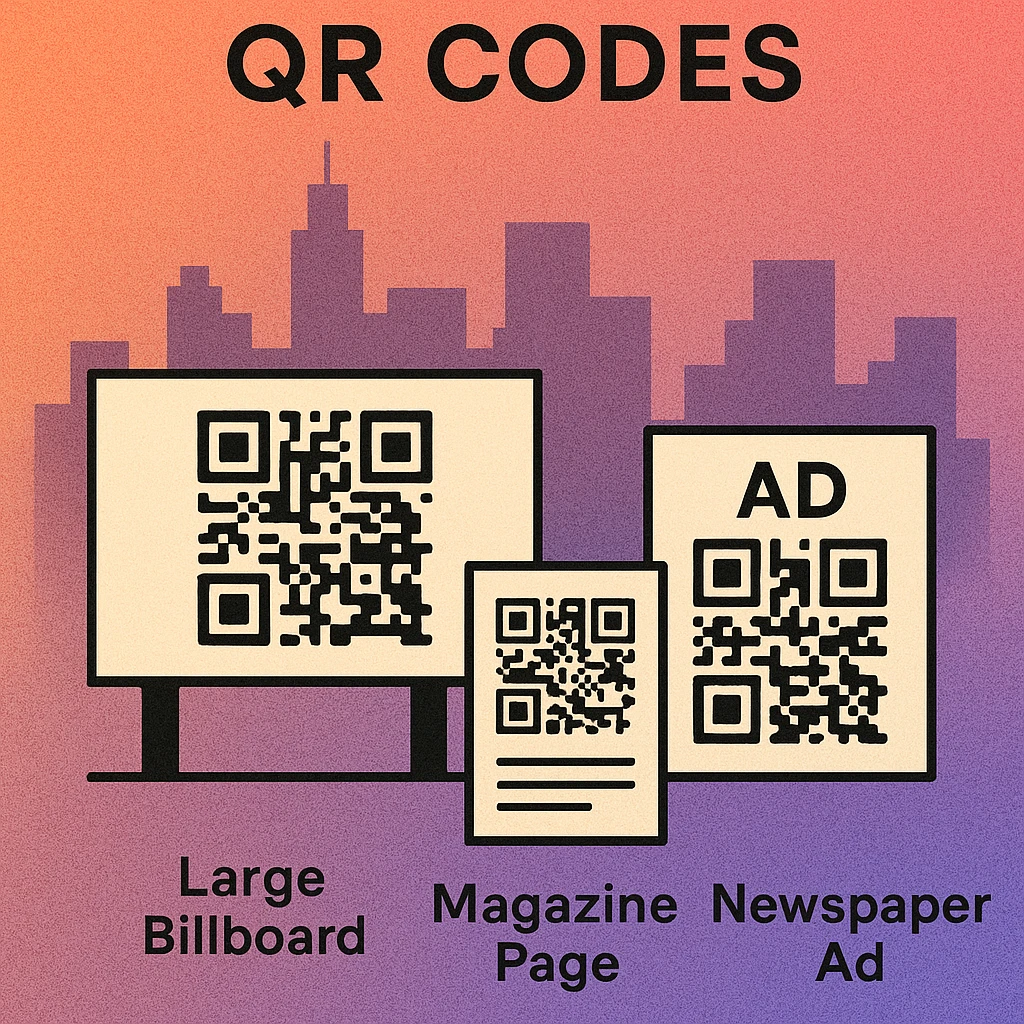
QR Codes by Print Format
Not all print advertising formats are equal. A billboard is seen from a moving car. A magazine ad is read at arm's length. A flyer is held in the hand. Each context changes the required QR code size, the amount of explanatory text needed, and the likelihood of an immediate scan.

| Format | Typical Viewing Distance | Min. QR Code Size | Recommended DPI | Scan Opportunity |
|---|---|---|---|---|
| Billboard (roadside) | 10–30 m | 80–150 cm | 15–30 DPI at final size | Low |
| Bus shelter / DOOH | 1–3 m | 12–20 cm | 150 DPI at final size | High |
| Magazine full-page | 30–50 cm | 2.5–4 cm | 300 DPI minimum | High |
| Flyer (A5–A4) | 25–40 cm | td>2–3.5 cm300 DPI minimum | Very High | |
| Poster (A2–A0) | 1–3 m | 5–15 cm | 150–300 DPI at final size | High |
| Direct mail postcard | 25–40 cm | 2–3 cm | 300 DPI minimum | Very High |
Billboards
Billboards are high-awareness, low-conversion formats. The primary goal of a billboard QR code is not an immediate scan but brand-level curiosity. Pedestrian-facing billboards (bus shelters, station platforms) are far more scannable than roadside formats where viewers are in vehicles. For roadside billboards, consider using the QR code to reinforce a URL that people can recall, rather than expecting immediate scans from a moving car.
Magazine and Print Publication Ads
Magazines offer ideal QR code conditions: stationary reader, close viewing distance, and high-quality paper reproduction. A properly printed QR code in a magazine ad is one of the highest-converting print QR placements available. Use a placement strategy that aligns the code with the ad's call to action rather than treating it as an afterthought in a corner.
Flyers and Handouts
Flyers are the most forgiving QR code format. The recipient holds the flyer at scanning distance, has time to read context around the code, and is already predisposed to act. Even a 2 cm × 2 cm QR code on a flyer will scan reliably from the typical hand-held distance. Use flyers to drive immediate action: sign-ups, offers, menus, event registration.
Posters
Posters occupy a middle ground. They are viewed from 1–3 metres, typically in dwell environments (waiting rooms, retail windows, exhibition halls). A QR code of 5–10 cm on an A2 poster is scannable from 1.5 metres. Posters often have longer display lives than flyers, making dynamic QR codes (where the destination URL can be updated without reprinting) especially valuable here.
Size and Distance Rules
The rule of thumb in print QR code sizing is simple: the code's side length should be at least one-tenth of the scanning distance. At 1 metre scanning distance, you need a minimum 10 cm code. At 3 metres, 30 cm minimum. This is a floor, not a target — larger is always safer.
For detailed size guidance by format, our dedicated article on QR code print resolution and DPI covers the full specification matrix including module count, version, and error correction interactions.
Minimum QR code side length = scanning distance ÷ 10. For a poster viewed from 2 metres: minimum code size = 20 cm. For a magazine ad at 40 cm reading distance: minimum = 4 cm. Add 20% buffer when using styled or coloured codes.
Additional factors that affect effective scanning distance include:
- Lighting conditions: Poorly lit environments (retail windows at night, underground stations) reduce effective range by up to 30%.
- Module style: Dot-style and diamond QR codes have softer edges that reduce effective range slightly. Use square or rounded modules for maximum distance performance.
- Error correction level: Higher error correction (level H) increases resilience when module edges are slightly degraded by printing imperfections or distance.
- Quiet zone: The blank border around the code must be maintained. In tight print layouts, designers frequently crop the quiet zone, causing failures that have nothing to do with size.
Print Specifications: DPI, CMYK, and File Format
A QR code that looks sharp on screen can fail in print if the underlying file is under-specified. Print production has non-negotiable technical requirements, and QR codes — with their precise module edges — are more sensitive to these than most design elements.
Resolution: DPI at Final Print Size
Always specify DPI relative to the final output size, not the file's native size. A 300 DPI file scaled up to 200% outputs at 150 DPI — which is below the threshold for reliable small-module QR codes. The safest approach is to export from a vector source (SVG or PDF) at the exact final dimensions, then rasterise to 300 DPI within your page layout application. For large-format output (banners, posters over A1), 150 DPI at final size is the accepted minimum; 300 DPI is recommended where budget allows.
Colour Mode: CMYK
All print production files must use CMYK colour mode. RGB-to-CMYK conversion at the press stage is unpredictable and can shift dark module colours enough to reduce contrast. For maximum reliability, use 100% K (black only) for QR code modules on a white or uncoated background. If your brand requires coloured modules, specify the exact CMYK values and confirm the resulting contrast ratio with your print supplier before going to press. A useful cross-link for colour contrast guidance is our guide on QR code placement best practices, which covers contrast and background selection.
File Format Recommendations
- SVG: Best format for all print work. Infinitely scalable, no pixelation at any size. Place inside your InDesign or Illustrator layout.
- PDF (vector): Equivalent to SVG for print; preferred by many printers for delivery.
- PNG at 300+ DPI: Acceptable for final-size placement. Never upscale. Use lossless compression only.
- JPEG: Avoid. Lossy compression creates artefacts around module edges that can cause scan failures, especially at small sizes.
Ink Spread and Bleed
On uncoated or absorbent paper stocks (newsprint, recycled flyers), ink spreads slightly after application, which thickens dark modules and narrows the white spaces between them. This is called ink gain. Compensate by using a slightly lower data density (fewer modules, i.e., a lower-version QR code with shorter encoded URL) and maximising the code's physical size. A URL shortener that reduces character count directly reduces module density and improves print robustness.
Placement in Print Ad Layouts
Where a QR code sits within an advertisement determines whether it is noticed, understood, and acted upon. Placement is not a cosmetic decision — it is a conversion decision.
Create a Print-Ready QR Code Now
Generate your QR code in seconds. Download SVG or PNG at any size, ready for your print production workflow.
Follow the Eye Flow
Western readers scan print layouts in a rough Z or F pattern: headline top-left, image centre, body copy, then bottom-right. Place your QR code at the natural terminus of this flow — typically the lower-right quadrant of the ad. This positions it as the action endpoint after the reader has processed the message, rather than an interruption mid-layout.
Clearance and Context
Surround the QR code with at least 10 mm of clear background space beyond the code's own quiet zone. Cramping the code against other design elements makes it harder to aim a camera at, especially on small-format ads. Always pair the code with a brief instructional label (“Scan to book”, “Scan for the full menu”) set in a legible 7–9 pt typeface directly adjacent to the code. Without context, many readers do not know what the code does or why they should scan it.
Contrast with Background
Avoid placing a QR code over a photograph, texture, or gradient background. The required contrast between dark modules and the background must be maintained uniformly across the entire code area. Even a subtle gradient beneath the code can cause the modules in the lighter corner to become unreadable. Place the code on a solid white, light grey, or brand-coloured panel with sufficient contrast. A white or light panel behind the code is always the safest choice.
Single vs. Multi-Column Layouts
In multi-column magazine layouts, the QR code typically anchors the closing column or sits within the outermost margin for easy camera access. In single-column formats (flyers, postcards), bottom-centre or bottom-right are both effective positions. For poster formats, position the code at eye level when possible and avoid the very bottom of the poster, where it may be obscured by poster holders or mounting hardware.
Pre-Print QR Code Checklist
Before approving any print job that includes a QR code, run through this checklist. A single missed step can produce thousands of non-functional codes with no fix short of a reprint.
Seven Steps Before You Go to Press
Test the live URL. Scan the final QR code and confirm the destination loads correctly on both iOS and Android. If it is a dynamic code, confirm the redirect is active and pointing to the right page.
Verify minimum size at final print dimensions. Open the print-ready PDF at 100% zoom in Acrobat and measure the QR code with the measuring tool. Confirm it meets the minimum size for its expected scanning distance.
Confirm the file is vector or 300 DPI raster. Place the file in your layout application and check the effective PPI in the Links panel (InDesign) or Image Size dialog (Photoshop). If it reads below 300 PPI at final size, re-export from source.
Check colour mode is CMYK. Open the exported PDF in Acrobat's Output Preview panel and verify all QR code elements are CMYK. Flag any RGB objects to your designer for correction before sending to the printer.
Measure contrast ratio. Use a colour contrast checker with the CMYK values of your modules and background. The ratio should be at least 4:1 (3:1 absolute minimum). Remember that uncoated paper stocks will reduce perceived contrast due to ink gain.
Print a proof and scan it. Request a printed proof at final size and test it with three devices: iPhone native Camera, Android Google Lens, and a third-party QR scanner app. Scan in average room lighting, not controlled studio conditions.
Confirm tracking is in place. If you are measuring print campaign performance, ensure UTM parameters or dynamic QR code analytics are configured before the print run begins. You cannot add tracking retroactively to a static QR code already printed.
Use SVG or 300 DPI PNG, export in CMYK, size the code to one-tenth of the scanning distance, maintain contrast and quiet zone, place at the layout's natural call-to-action endpoint, and always test a physical proof before approving the full print run.
Frequently Asked Questions
For a standard roadside billboard viewed from 10–15 metres, the QR code should be at least 80–100 cm (roughly 3 feet) per side. At 30 metres viewing distance, increase to 150 cm or more. The general rule is that the code's side length in centimetres should equal at least one-tenth of the viewing distance in centimetres. Always test by photographing the finished billboard from the intended scan position.
Export QR codes at a minimum of 300 DPI for standard print (flyers, magazines, brochures). For large-format printing like banners and posters, 150 DPI at final size is acceptable, but 300 DPI at final size is safer. Always export from a vector source (SVG or PDF) if possible, then convert to rasterised output at the required DPI. Never scale up a low-resolution raster QR code, as this blurs module edges and causes scan failure.
Use CMYK for any print production file. RGB images converted at the press stage can produce unexpected colour shifts, especially in the dark modules of a QR code. For maximum reliability, use 100% K (black) for modules on a white or light background. If using brand colours, ensure the CMYK equivalent maintains a contrast ratio of at least 4:1 against the background, and avoid any colour combination where the modules register below 70% perceived darkness.
Place the QR code in the lower-right or lower-left corner of the ad layout, where it reads as a natural call-to-action endpoint after the eye travels through headline, image, and body copy. Avoid placing it at the very edge of the bleed area. Surround it with at least 10 mm of clear space on all sides, in addition to the code's own quiet zone. Add a short instructional label like “Scan to learn more” directly above or below the code.
Yes, QR codes work on glossy magazine paper provided the contrast is sufficient and the reader is not obscured by specular glare at scanning time. Use a matte or semi-gloss finish for the code area where possible. Avoid reversed (white on black) codes on glossy stock, as ink spread can thicken the dark border and narrow the white modules. A standard dark-on-light code printed at 300 DPI on coated stock performs reliably.